10 Website Mistakes That Are Costing Your Business Customers in 2026
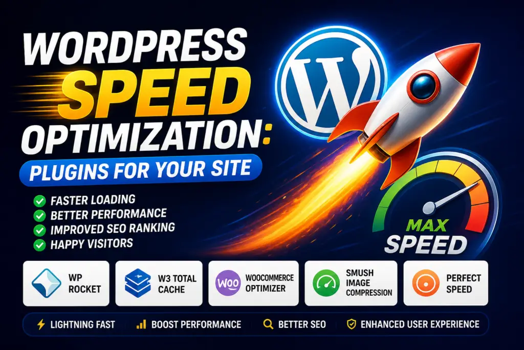
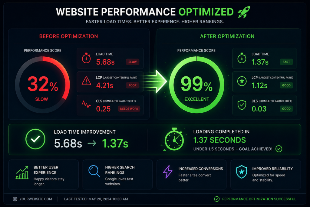
What are the main website mistakes costing businesses customers? In 2026, the critical mistakes causing low website conversion include poor mobile responsiveness, slow page loading speeds, confusing user interfaces, lack of clear calls to action, poor content accessibility, and missing social proof. Remedying these layout flaws with modern website design anddevelopment converts passing traffic into consistent business leads. Introduction The marketplace landscape of 2026 is uncompromising. Digital traffic has grown more fragmented, consumer attention spans fluctuate rapidly, and buyers demand seamless digital experiences. Your business website is no longer just an online brochure or a digital placeholder—it is the functional hub of your operations, yourprimary brand representative, and your most vital sales pipeline asset.Yet, thousands of entrepreneurs, small business owners, and startups wonder why their digital investments fail to yield significant returns. They pour financial capital into paid advertising and social media distribution, only to watch incoming traffic escape instantly. The hard truth is this: a poorly structured setup repels modernconsumers faster than high pricing or fierce competition ever could.Every design flaw, slow-loading block, and unclear headline creates friction. In digital commerce, user friction translates directly into lost revenue. If your digital channel is not explicitly built for maximum clarity, your hard earned traffic bounces straight to competitors. This manual breaks down the 10 most damaging mistakesbusinesses commit with their online properties in 2026, offering actionable corrections to turn your platform into an elite lead generation website The 2026 Standard: SEO, Page Speed, Mobile Responsiveness, andUX Modern website development requires balancing various technical disciplines to build trust with users and search algorithms. Today’s search engines use machine-learning algorithms that prioritize explicit user satisfaction metrics alongside text-based content signals. To excel, a modern site must balance four primaryfoundational elements: Search Engine Optimization (SEO) Constructing an SEO-friendly website is no longer just about placing keywords throughout a page. True discovery in 2026 requires strict compliance with Google’s EEAT framework (Experience, Expertise, Authoritativeness, and Trustworthiness). Search bots look for deep topic coverage, transparent authorship credentials, secure infrastructure, and structured structured data. If your architecture hides value from web crawlers, your organic visibility will decline. Page Speed Architecture Speed remains a critical component of user experience and technical optimization. Modern infrastructure demands instantaneous rendering. Every millisecond of latency decreases website conversion rates. Astechnical requirements tighten, micro-delays can hurt your organic keyword visibility across competitivecategories. True Mobile Responsiveness Mobile web traffic has surpassed traditional desktop browsing for nearly a decade, but 2026 demands more than just standard responsive design. Today’s standard is mobile-first design. Interfaces must feel native on handheld devices, accounting for thumb positions, varied light levels, and uneven cellular connections. Intuitive User Experience (UX) User experience bridges the gap between raw web traffic and conversion. UX covers how your site feels, how easily information is found, and how comfortably a buyer moves toward conversion. When a design lacks visual order, visitors exit immediately Mistake 1: Ignoring AI Search Optimization and Schema Markup Many small business owners construct websites solely for human eyes while ignoring the programmatic structures that search engines use to scan and interpret content. In 2026, traditional search queries are deeply integrated with AI-driven summaries and answer engines. If your site lacks structured schema metadata, it remains invisible to these automated answer systems. The Practical Solution Incorporate comprehensive JSON-LD schema code across your entire product structure. Ensure you declare precise definitions for local operating hours, localized service footprints, transparent pricing brackets, and direct client testimonials. By organizing your technical code correctly, you turn your standard digital setup intoan SEO-friendly website capable of earning visibility in automated search carousels Mistake 2: Failing the “3-Second” Page Load Threshold Consumer patience has hit historic lows. If your digital infrastructure requires more than three seconds to display its primary visual blocks, visitors will leave before seeing your marketing message. Many modern sites are slowed down by excessive script libraries, unoptimized media, and budget hosting plans The Practical Solution Mistake 3: Mobile Layouts Treated as an Afterthought Too many companies review and approve their website design prototypes exclusively on large desktop displays. They assume that if a layout looks good on a large office monitor, it will automatically scale down effectively for handheld users. This often results in text that is too small to read, overlapping tap targets, andbroken forms that disrupt mobile conversion paths The Practical Solution Adopt an aggressive mobile-first approach to website development. Build and test mobile responsive mockups before working on desktop versions. Ensure all buttons are at least 48px tall to accommodate touch inputs, keep form fields simplified, and use responsive, variable typography that remains legible across screens of all sizes. Mistake 4: Vague and Distracting Calls to Action (CTAs) A frequent error among business operators is failing to clearly guide visitors on what to do next. When a platform uses passive phrases like “Learn More,” “Read History,” or “Discover Our Story,” it leaves the user guessing. Alternatively, cluttering a single section with multiple competing offers causes decision paralysis The Practical Solution Establish a clear, singular primary call to action across your main pages. Use direct, action-oriented phrases like “Book Your Free Audit” or “Claim Your Strategy Session.” Keep your primary CTA button in a high-contrast color that stands out from the rest of your palette, and place it clearly above the fold to capture immediateintent Mistake 5: Overcomplicated Navigation and Confusing UserJourneys When buyers arrive on your site, they want to find answers immediately. Creative but unusual navigation systems—such as hidden side menus, non-standard icon labels, or multi-layered drop-downs—often confuse users. If visitors have to think too hard just to browse your services, they will leave and look elsewhere The Practical Solution Stick to familiar, intuitive navigation structures. Use a clean horizontal menu on desktop and a standard hamburger icon on mobile. Stick to straightforward, descriptive labels like “Services,” “Pricing,” “Case Studies,” and “Contact Us.” Try to structure your architecture so that any core page can be reached withinthree clicks or less from the homepage. Mistake 6: Lack of