What are the main website mistakes costing businesses customers?
In 2026, the critical mistakes causing low website conversion include poor mobile responsiveness, slow page loading speeds, confusing user interfaces, lack of clear calls to action, poor content accessibility, and missing social proof. Remedying these layout flaws with modern website design and
development converts passing traffic into consistent business leads.
Introduction
The marketplace landscape of 2026 is uncompromising. Digital traffic has grown more fragmented, consumer attention spans fluctuate rapidly, and buyers demand seamless digital experiences. Your business website is no longer just an online brochure or a digital placeholder—it is the functional hub of your operations, your
primary brand representative, and your most vital sales pipeline asset.
Yet, thousands of entrepreneurs, small business owners, and startups wonder why their digital investments fail to yield significant returns. They pour financial capital into paid advertising and social media distribution, only to watch incoming traffic escape instantly. The hard truth is this: a poorly structured setup repels modern
consumers faster than high pricing or fierce competition ever could.
Every design flaw, slow-loading block, and unclear headline creates friction. In digital commerce, user friction translates directly into lost revenue. If your digital channel is not explicitly built for maximum clarity, your hard earned traffic bounces straight to competitors. This manual breaks down the 10 most damaging mistakes
businesses commit with their online properties in 2026, offering actionable corrections to turn your platform into an elite lead generation website
The 2026 Standard: SEO, Page Speed, Mobile Responsiveness, and
UX
Modern website development requires balancing various technical disciplines to build trust with users and search algorithms. Today’s search engines use machine-learning algorithms that prioritize explicit user satisfaction metrics alongside text-based content signals. To excel, a modern site must balance four primary
foundational elements:
Search Engine Optimization (SEO)
Constructing an SEO-friendly website is no longer just about placing keywords throughout a page. True discovery in 2026 requires strict compliance with Google’s EEAT framework (Experience, Expertise, Authoritativeness, and Trustworthiness). Search bots look for deep topic coverage, transparent authorship credentials, secure infrastructure, and structured structured data. If your architecture hides value from web crawlers, your organic visibility will decline.
Page Speed Architecture
Speed remains a critical component of user experience and technical optimization. Modern infrastructure demands instantaneous rendering. Every millisecond of latency decreases website conversion rates. Astechnical requirements tighten, micro-delays can hurt your organic keyword visibility across competitive
categories.
True Mobile Responsiveness
Mobile web traffic has surpassed traditional desktop browsing for nearly a decade, but 2026 demands more than just standard responsive design. Today’s standard is mobile-first design. Interfaces must feel native on handheld devices, accounting for thumb positions, varied light levels, and uneven cellular connections.
Intuitive User Experience (UX)
User experience bridges the gap between raw web traffic and conversion. UX covers how your site feels, how easily information is found, and how comfortably a buyer moves toward conversion. When a design lacks visual order, visitors exit immediately
Mistake 1: Ignoring AI Search Optimization and Schema Markup
Many small business owners construct websites solely for human eyes while ignoring the programmatic structures that search engines use to scan and interpret content. In 2026, traditional search queries are deeply integrated with AI-driven summaries and answer engines. If your site lacks structured schema metadata, it remains invisible to these automated answer systems.
The Practical Solution
Incorporate comprehensive JSON-LD schema code across your entire product structure. Ensure you declare precise definitions for local operating hours, localized service footprints, transparent pricing brackets, and direct client testimonials. By organizing your technical code correctly, you turn your standard digital setup into
an SEO-friendly website capable of earning visibility in automated search carousels
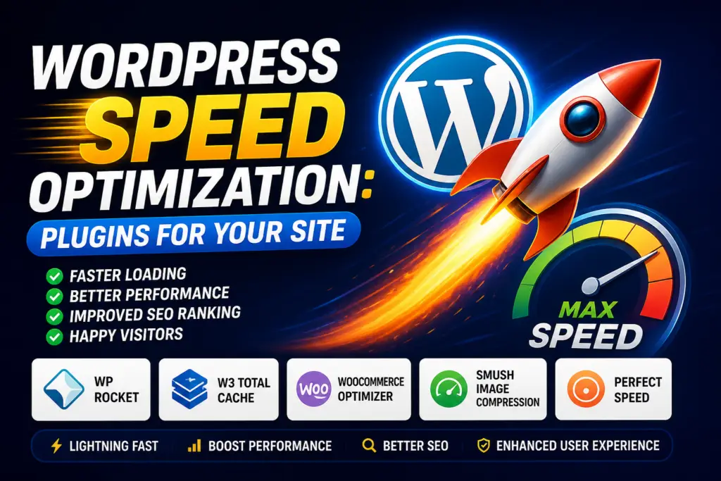
Mistake 2: Failing the “3-Second” Page Load Threshold
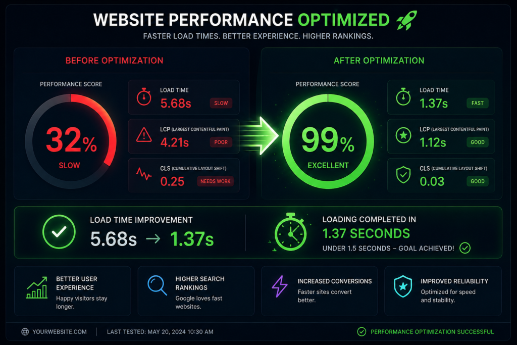
Consumer patience has hit historic lows. If your digital infrastructure requires more than three seconds to display its primary visual blocks, visitors will leave before seeing your marketing message. Many modern sites are slowed down by excessive script libraries, unoptimized media, and budget hosting plans
The Practical Solution
- Switch to specialized, high-performance cloud hosting networks.
- Compress all media files into modern, lightweight file types like WebP or AVIF.
- Implement progressive lazy loading so visual elements render only as users scroll down.
- Minimize tracking codes and defer non-essential JavaScript to keep execution paths clear
Mistake 3: Mobile Layouts Treated as an Afterthought
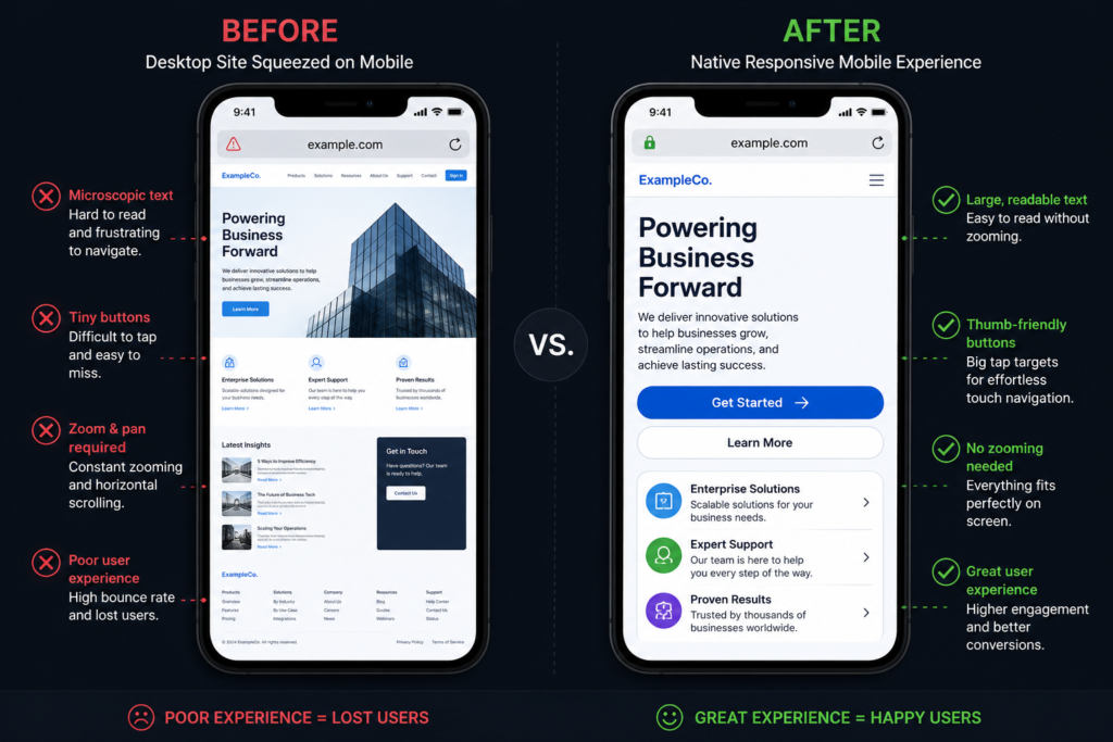
Too many companies review and approve their website design prototypes exclusively on large desktop displays. They assume that if a layout looks good on a large office monitor, it will automatically scale down effectively for handheld users. This often results in text that is too small to read, overlapping tap targets, and
broken forms that disrupt mobile conversion paths
The Practical Solution
Adopt an aggressive mobile-first approach to website development. Build and test mobile responsive mockups before working on desktop versions. Ensure all buttons are at least 48px tall to accommodate touch inputs, keep form fields simplified, and use responsive, variable typography that remains legible across screens of all sizes.
Mistake 4: Vague and Distracting Calls to Action (CTAs)
A frequent error among business operators is failing to clearly guide visitors on what to do next. When a platform uses passive phrases like “Learn More,” “Read History,” or “Discover Our Story,” it leaves the user guessing. Alternatively, cluttering a single section with multiple competing offers causes decision paralysis
The Practical Solution
Establish a clear, singular primary call to action across your main pages. Use direct, action-oriented phrases like “Book Your Free Audit” or “Claim Your Strategy Session.” Keep your primary CTA button in a high-contrast color that stands out from the rest of your palette, and place it clearly above the fold to capture immediate
intent
Mistake 5: Overcomplicated Navigation and Confusing User
Journeys
When buyers arrive on your site, they want to find answers immediately. Creative but unusual navigation systems—such as hidden side menus, non-standard icon labels, or multi-layered drop-downs—often confuse users. If visitors have to think too hard just to browse your services, they will leave and look elsewhere
The Practical Solution
Stick to familiar, intuitive navigation structures. Use a clean horizontal menu on desktop and a standard hamburger icon on mobile. Stick to straightforward, descriptive labels like “Services,” “Pricing,” “Case Studies,” and “Contact Us.” Try to structure your architecture so that any core page can be reached within
three clicks or less from the homepage.
Mistake 6: Lack of Social Proof and Verification Signals
Online buyers are naturally skeptical. Without clear indicators of trust, credibility, and verified real-world
results, a digital storefront can feel risky or unproven. Anonymous text quotes or vague statistics do little to
build genuine confidence with prospective buyers.
The Practical Solution
Embed authenticated social proof directly into your core user paths. Feature verified review streams from
trusted platforms like Google Business Profile, Trustpilot, or Yelp. Highlight detailed case studies that show
clear metrics, include video testimonials from real clients, and prominently display relevant industry
certifications or compliance badges.
Mistake 7: Outdated Content and Neglected Blog Foundations
An outdated website can quietly undermine your brand’s credibility. When a prospect visits your site and
notices copyright notices from three years ago, abandoned social media widgets, or a company blog whose
last update was in 2023, it sends the wrong signal. It suggests a business that is stagnant, unresponsive, or
potentially out of business.
The Practical Solution
Keep your content fresh and up to date. Establish a manageable content schedule to publish fresh insights,
relevant case studies, or seasonal updates. Regularly review your core landing pages to remove broken links,
update statistics, and ensure your messaging aligns with your current service offerings.
Mistake 8: Forgetting Gated Content and Lead Capture Mechanisms
Most prospects who visit your site for the first time are not quite ready to buy immediately. They are often in
the early research phase, comparing their options. If your site only offers an all-or-nothing “Buy Now” or
“Contact Us” option, you miss the opportunity to connect with buyers who need a bit more time and nurturing.
The Practical Solution
Design multi-tiered conversion opportunities tailored to different stages of the buyer’s journey. Create helpful
lead magnets—such as specialized checklists, industry reports, or interactive tools—that add immediate
value. By offering these in exchange for an email address, you can turn your site into a highly effective lead
generation website that builds a valuable database for ongoing email marketing.
Mistake 9: Gaps in Accessibility and Compliance Standards
Web accessibility is an essential component of professional web design. Modern websites must be usable for
everyone, including individuals with visual, auditory, motor, or cognitive challenges. Failing to meet established
web compliance standards can expose your business to legal risks, hurt your search rankings, and alienate a
significant portion of your potential audience.
The Practical Solution
Bring your platform up to Web Content Accessibility Guidelines (WCAG 2.1 AA) compliance standards. Use
high-contrast color palettes, include clear alt-text descriptions for all visual elements, ensure the entire site can
be navigated using only a keyboard, and use semantic HTML header structures so screen readers can easily
parse your content.
Mistake 10: Hidden Pricing and Confusing Core Offers
Consumers appreciate transparency and clarity. When a business buries its pricing details or uses confusing
language to describe its services, it can create a sense of uncertainty. Forcing users to complete lengthy forms or schedule introductory calls just to learn basic baseline pricing can drive them to competitors who
share that information openly
The Practical Solution
Present your core services and pricing structures clearly and plainly. If your work is custom and complex,
provide clear starting-at baselines, estimated price ranges, or interactive estimators. Break down exactly what
is included in each package so prospects can easily determine if your services align with their budget and
needs.
Core ROI: How Professional Website Design Drives Lead
Generation
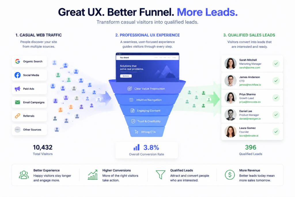
Your online presence shouldn’t just look nice; it needs to perform as a reliable sales tool for your business.
Moving from an unoptimized layout to an elite, professionally crafted lead generation website can
fundamentally improve your business growth. Professional website design strategically removes the friction
that causes potential customers to drop off, resulting in measurable improvements across your entire sales
funnel.
When expert developers build your site, every element is designed to support user conversion. The structural
hierarchy naturally guides visitors’ attention toward your core value propositions. High-performance code
keeps loading speeds fast, while responsive layouts ensure a smooth experience across all screen sizes. This
balance of professional design and technical performance builds immediate trust, encouraging users to share
their contact information or complete a purchase.
To illustrate the financial impact of professional conversion optimization, consider the following conversion rate
formula:
CR = \left( rac{L}{V} ight) imes 100
Where CR represents the conversion rate percentage, L is the total number of qualified leads captured, and V
equals total visitor traffic. If your site attracts 10,000 monthly visitors with an unoptimized 0.5% conversion
rate, it generates 50 leads. By working with professionals to improve your user experience and lift that
conversion rate to 3.0%, those same 10,000 visitors produce 300 leads—6x increase in lead volume without
spending an extra dollar on advertising traffic.
Frequently Asked Questions (FAQ Setup)
How frequently should a small business update its website layout?
To maintain a modern look and strong security, businesses should consider a structural update or redesign
every 2 to 3 years. However, technical optimizations like updating core plug-ins, adjusting SEO metadata, and
refreshing content should happen on an ongoing monthly basis
What is the distinction between responsive layout and mobile-first construction?
Responsive layout scales a desktop-focused design down to fit smaller mobile screens. Mobile-first
construction reverses this process: it designs the user interface for smartphones first, ensuring a fast,
lightweight experience, and then expands the layout for larger desktop displays.
Will updating our website platform disrupt our current Google search rankings?
A major redesign can temporarily impact search visibility if handled incorrectly. However, by working with an
experienced team that uses proper 301 redirect mapping, maintains consistent URL structures, and keeps
clean SEO metadata, a upgrade can actually improve your search rankings over the long run.
Conclusion & Next Steps
In 2026, an underperforming business website is a quiet revenue drain. Every confusing navigation menu,
slow-loading block, and hidden pricing tier gives potential customers a reason to leave and find a competitor.
Conversely, addressing these technical and design gaps can turn your platform into an efficient, automated
pipeline for customer acquisition.
Fixing these common mistakes requires moving away from generic templates and focusing on deliberate,
conversion-oriented design and development. Your digital presence should be fast, easy to navigate, fully
optimized for search engines, and built to convert casual visitors into qualified business leads. Don’t let layout
flaws hold your business back from its true growth potential.
Transform Your Digital Asset with Digital Wingman Agency
Are you ready to stop losing customers to outdated website design choices? At Digital Wingman
Agency, we build high-performance, conversion-focused websites engineered for your long-term
business success. Our expert team integrates modern website development practices, clean mobile
first design, and advanced SEO strategies to build platforms that look great and drive meaningful
revenue growth.
Don’t let technical issues or confusing user journeys limit your growth. Reach out to Digital Wingman
Agency today for a comprehensive, personalized digital performance audit, and let’s turn your website
into your business’s strongest growth engine